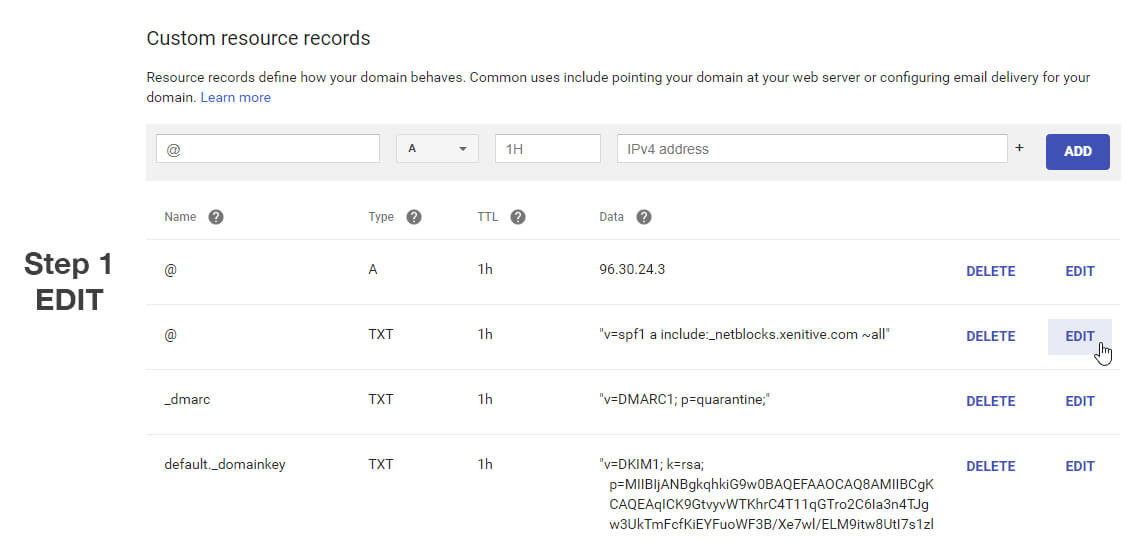
What you have to do, is ADD the new record in with the existing record. Hit EDIT to the right of the existing record, then hit the + to add a new record to it.
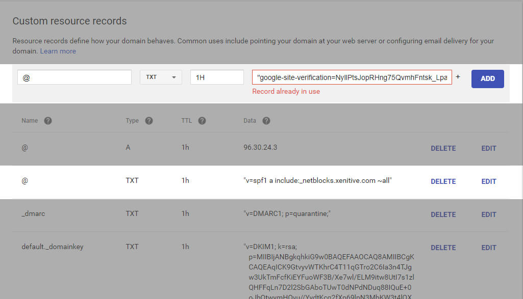
See, all of the records are grouped by the @ / subdomain. If you're trying to add a new @ TXT record and you already have another @ TXT record, you're adding it in the wrong place if you try to use the top input field area. In all honestly, this is a horrible UX choice on the Google Domain teams part. They should have it automatically merge in a new record with what is already there instead of making you hit Edit -> + THEN add the new record...
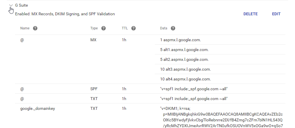
I say all of that and while the UX may seem like a bad design up-front, it really isn't all that bad "once you get used to it". The problem is that 99% of all other registrars use a single line to add a new record just like Google Domains. The difference is that when you add the line on other registrars, the line is added as a completely new line so it doesn't care if the Name is already used. Google Domains on the other hand, only reserves this blank input form for brand new DNS records that haven't been associated because all similar types and names are grouped together. Since almost all of the registrars use a blank input for adding all records, people come over to Google Domains and expect it to work the same way, then can't figure out why they're getting Record already in use errors for simple DNS additions. If you're adding different CNAMES with the main input form, you shouldn't ever see the error unless it does actually exist. On Google Domains for MX records, TXT records SRV records etc where there can be multiple records for the same type and name however, you can only use the input form on the very first creation of the record type to get it going.
The way Google does it is super easy and doesn't take that long when you get used to it, but if you're new to Google Domains or coming back after some time away, that wonderful ol' error Record already in use can be a pain to troubleshoot because it doesn't follow the same UX pattern of any other registrars.
Check out the pics below for some guides and I'm sure you'll get it figured out!


Post Comment